Evolution of a portrait
Ah, technology. I've always been interested in how the creative process expresses itself--sometimes even without the conscious will of the creator. I'm sure many creative types know what I mean when I talk about that feeling after stumbling upon a completed work you hadn't looked at in a while, and saying to yourself: "How the hell did I do that?"
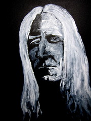
Anyway, in the spirit of Deconstructionism, Postmodernism, and all other things both holy and profane,, here's the three main stages of BG's (aka Clyde's) construction of this painting.
I've had the pleasure to witness many such metamorphoses since having met Clyde. There's times when I think his earlier "drafts" are just as compelling--if not more so--than the final finished product.
But I do think the tthree versions make for a nice series, or as Francis Bacon might have put it, Studies toward a Portraitt of Johnny Winter.
Which one do you think says it best?


5 Comments:
I like the second. But there's something compelling about the third. The first looks entirely different, much less dark
What version you like I think goes with mood and with the stage of life you're in--been thinking a lot about that lately
Interesting that our thought patterns are running along similliar paths.
Beautifully written
Great work, and I think they should be collected and shown together.
Thats cool watching the evolution of someones imagination from its conception to its ultimate birth.
Great work on the canvas and in your rpost
I think that I like Version 1 because I like the use of black and white together. Plus, it makes the emotion that much darker, especially combined with the more tortured facial expression, which I think is great.
I'd have to go with version 1 because I think the eyes are captured best in that one. My husband would love these.
Post a Comment
<< Home